CSS transform Property
Introduction to CSS transform Property
Transformation एक process होती है जिसमें elements को visually modify किया जाता है। Webpage elements पर 2D और 3D transformation apply करके आप उन्हें real life effects दे सकते है। इससे webpage और भी real और live लगने लगता है।
कुछ समय पहले तक webpages में 2D और 3D transformation apply करना असंभव था। इसके लिए special softwares और plugins use किये जाते थे जैसे की flash आदि। लेकिन इसकी वजह से webpage की size बहुत अधिक बढ़ जाती थी जिससे page load होने में बहुत समय लगता था।
2D और 3D transformation की बढ़ती हुई popularity को देखते हुए CSS3 में एक बहुत ही उपयोगी property add की गयी है जिसके द्वारा आप web page elements पर 2D और 3D transformation आसानी से apply कर सकते है। यह property transform के नाम से जानी जाती है।
CSS transform property द्वारा आप webpage elements पर निचे दिए जा रहे transformations apply कर सकते है।
- Translation - Elements को एक coordinate position से दूसरी coordinate position पर move करना।
- Rotation - Element को आवश्यकता अनुसार अलग अलग angles पर rotate करना।
- Scaling - Elements की size को बढ़ाना और घटाना।
- Skewing - Elements को अलग अलग angles पर तिरछा करना।
इन transformations को apply करने के लिए transform property की value के रूप में अलग अलग transformation functions को use किया जाता है।
Syntax of CSS transform Property
CSS transform property का general syntax निचे दिया जा रहा है।
transform : none | transformation-function;
जैसा की आप ऊपर दिए गए syntax में देख सकते है transform property की value none या फिर किसी transform function के रूप में define की जाती है।
जब आप transform property की value none define करते है तो किसी भी प्रकार का transformation apply नहीं होता है।
Transformation function के रूप में आप निचे दी जा रही values को define कर सकते है।
- matrix(n,n,n,n,n,n) - यह function 6 values के द्वारा 2D transformation create करने के लिए प्रयोग किया जाता है। इस function में सभी transformations और दोनों axis की value एक ही बार में pass की जाती है।
- matrix3d(n,n,n,n,n,n,n,n,n,n,n,n,n,n,n,n) - यह function 16 values के द्वारा 3D transformation create करने के लिए प्रयोग किया जाता है।
- translate(x,y) - यह function 2D translation define करने के लिए प्रयोग किया जाता है। इसमें x और y axis के coordinates pass किये जाते है।
- translate3d(x,y,z) - यह function 3D translation define करने के लिए प्रयोग किया जाता है। इसमें x, y और z axis के coordinates pass किये जाते है।
- translateX(x) - यह function X-axis coordinates से translation define करने के लिए प्रयोग किया जाता है।
- translateY(y) - यह function Y-axis coordinates से translation define करने के लिए प्रयोग किया जाता है।
- translateZ(z) - यह function Z-axis coordinates से translation define करने के लिए प्रयोग किया जाता है।
- scale(x,y) - यह function element को 2D scale करने के लिए प्रयोग किया जाता है। इसमें x और y axis coordinates pass किये जाते है।
- scale3d(x,y,z) - यह function element को 3D scale करने के लिए प्रयोग किया जाता है। इसमें x, y और z axis coordinates pass किये जाते है।
- scaleX(x) - यह function element को X-axis coordinates से scale करने के लिए प्रयोग किया जाता है।
- scaleY(y) - यह function element को Y-axis coordinates से scale करने के लिए प्रयोग किया जाता है।
- scaleZ (z) - यह function element को Z-axis coordinates से scale करने के लिए प्रयोग किया जाता है।
- rotate(angle) - यह function पास किये गए angle के अनुसार element को 2D rotate करता है।
- rotate3d(x,y,z,angle) - यह function pass किये गए x, y और z axis coordinates और angle के अनुसार element को rotate करता है।
- rotateX(x) - यह function X axis coordinates के अनुसार element को rotate करता है।
- rotateY(y) - यह function Y axis coordinates के अनुसार element को rotate करता है।
- rotateZ(z) - यह function Z axis coordinates के अनुसार element को rotate करता है।
- skew(x-angle,y-angle) - यह function pass किये जा रहे x और y axis coordinate angles के अनुसार element का skew transformation करता है।
- skewX(angle) - यह function X axis के angle अनुसार elements का skew transformation करता है।
- skewY(angle) - यह function Y axis के angle अनुसार elements का skew transformation करता है।
- perspective(n) - यह function किसी 3D में transform किये गए element का perspective view define करता है।
Example of CSS transform Property
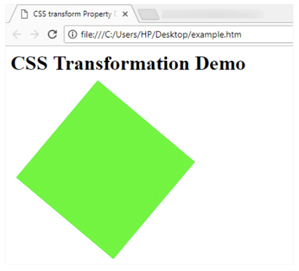
निचे transform property को simple उदाहरण द्वारा समझाया जा रहा है।
<html>

<head>
<title>CSS transform Property Demo</title>

<style>
#myDiv
{
     width:200px;
     height:200px;
     margin:50px;
     background-color:lime;
     transform:rotate(40deg);
}
</style>
</head>

<body>
<h1>CSS Transformation Demo</h1>
<div id="myDiv"> </div>
</body>
ऊपर दिया गया उदाहरण निचे दिया गया output generate करता है।